Graphic Design · Logo design
João Sá
Medicina Integrativa
Context and design rationale
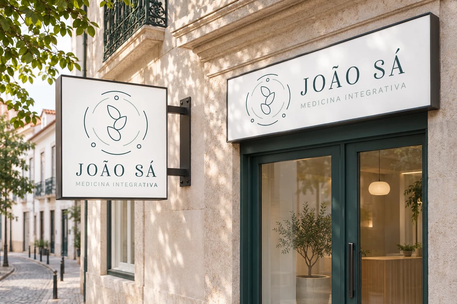
João Sá · Medicina Integrativa needed a visual signature connecting name, practice and symbol. The work shown focuses on the logo and its horizontal and vertical versions, with an illustrative signage application.
I designed a composition using organic lines and two green tones. The horizontal version gives the name and descriptor space; the vertical version reorganises the same identity for more compact proportions. The street scene shows an application possibility, not a confirmed installation.
Reading and interaction flow
An editorial synthesis of the presented materials, prepared for this case. It is not a documented production or research workflow.
- Recognise the symbol
- Read the name
- Identify the practice
- Adapt the signature to the format
System and applications
The demonstrated system contains two arrangements of one signature. Symbol, name, descriptor and colours preserve the identity while their relationship changes with the format. No additional applications or brand rules are attributed to the project beyond the documented material.
My contribution
I created the logo for João Sá · Medicina Integrativa. The horizontal signature combines an organic line symbol with the name and practice descriptor, in two shades of green.
Logo design by Joana Lopes Mesquita.
Two compositions. One identity.