Denne prosjektstudien vises i den engelske originalversjonen.
Context
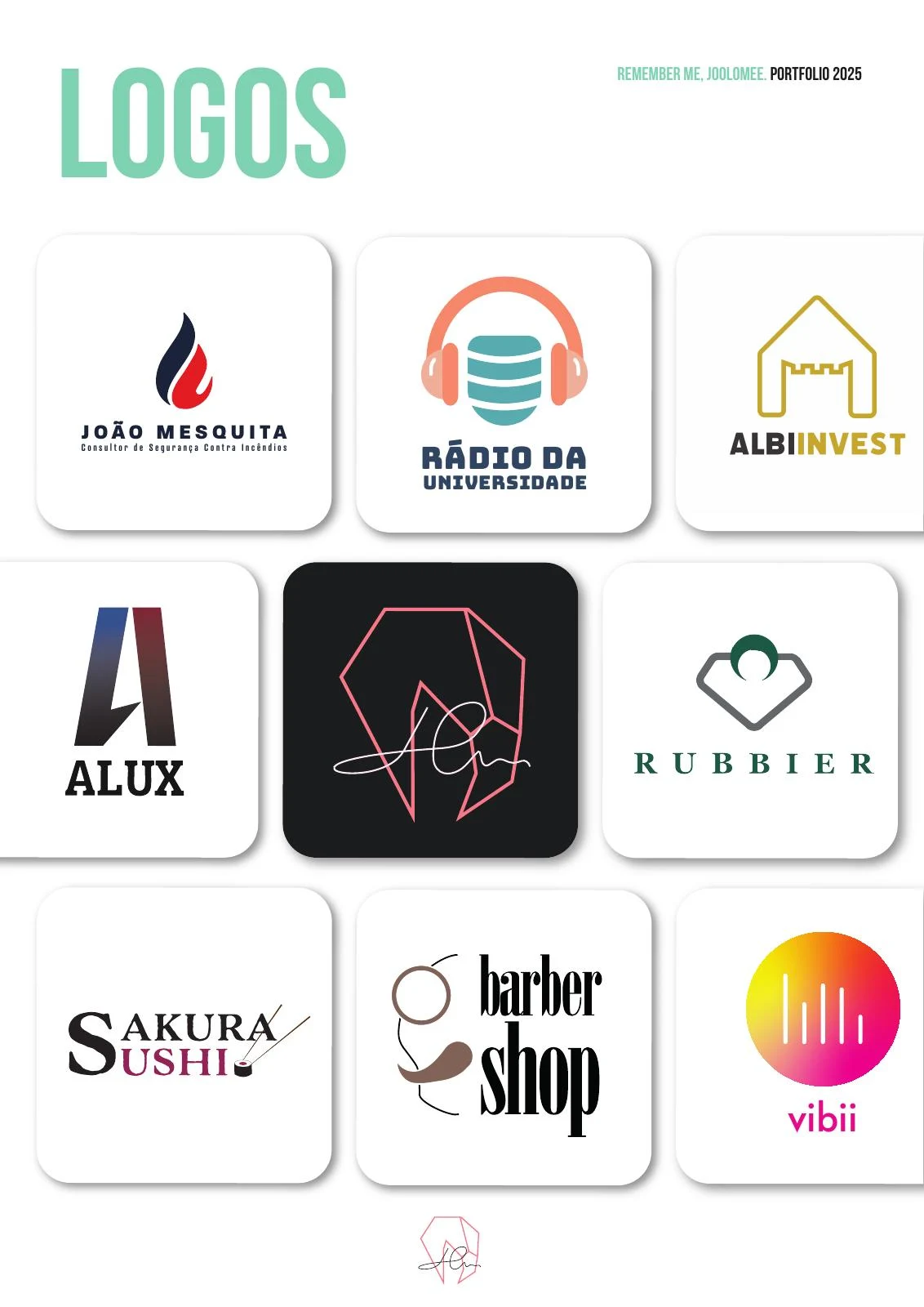
This selection brings together logos from different sectors. The case shows how symbol, name and composition relate within each identity, without treating every project as a response to the same brief.
My contribution covers the graphic concepts, symbols and typographic compositions shown. Available versions make proportion, legibility and format adaptation visible. Each brand retains its own visual language.
Reading and interaction flow
An editorial synthesis of the presented materials, prepared for this case. It is not a documented production or research workflow.
- Identify the brand
- Read the signature
- Recognise the symbol
- Adapt to the format
Min rolle
Graphic concepts, symbols and typographic composition.
Problem
A selection from the 2025 logo portfolio, featuring brands from different sectors.
Constraints
Research
Options considered
Decisions & why
The relationship between symbol and name changes with the context. The selection includes work for hospitality, retail, radio and services.
A reading of the presented artefacts, not a reconstructed research or testing process.
Components & system
The unit of analysis is each brand signature: symbol, lettering, scale relationships and available versions. A logo alone does not establish the existence of a complete guideline set or manufactured applications.
Outcome
Original portfolio board, including Rádio da Universidade, Albinvest, Alux, Sakura Sushi and vibii.