An identity that works as a system
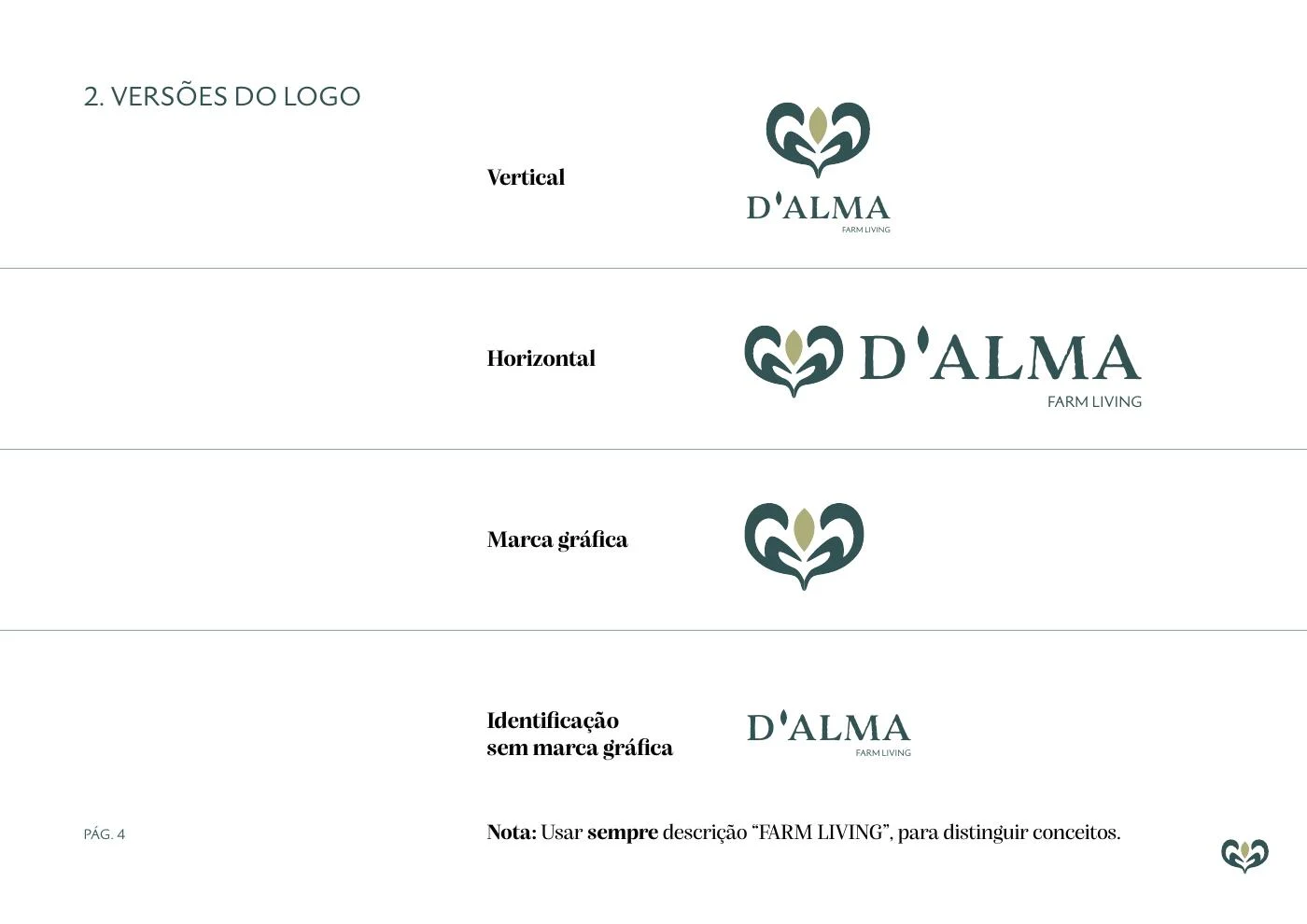
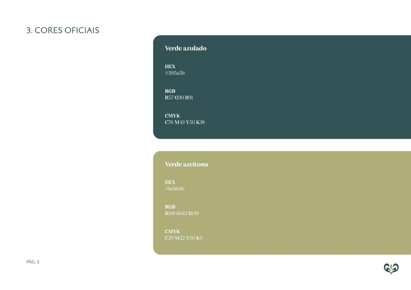
The guidelines define horizontal and vertical versions, symbol, colours, typography and clear space. These rules allow the signature to adapt to each format without rebuilding the brand for every asset.
Tämä projektikuvaus esitetään alkuperäisenä englanninkielisenä versiona.
D’ALMA FARMLIVING connects a farm- and nature-led identity with products that need to remain recognisable across formats. Brand direction is about that continuity: a bottle, a fruit label and an Instagram post should belong to the same brand without repeating the same composition.
As Branding Director, I worked on visual identity, packaging and art direction. The material shown includes brand guidelines, logo variants, label studies, the premium 500 mL presentation and Instagram communication. The case demonstrates applications of the identity; mockups are not evidence of manufacturing, distribution or commercial results.
An editorial synthesis of the presented materials, prepared for this case. It is not a documented production or research workflow.
Branding Director · Brand identity and creative direction.
How can a brand remain recognisable across premium olive oil, fresh produce, labels and digital communication? The challenge combines identity and use: recognising origin, distinguishing products and finding relevant information.
The guidelines define horizontal and vertical versions, symbol, colours, typography and clear space. These rules allow the signature to adapt to each format without rebuilding the brand for every asset.
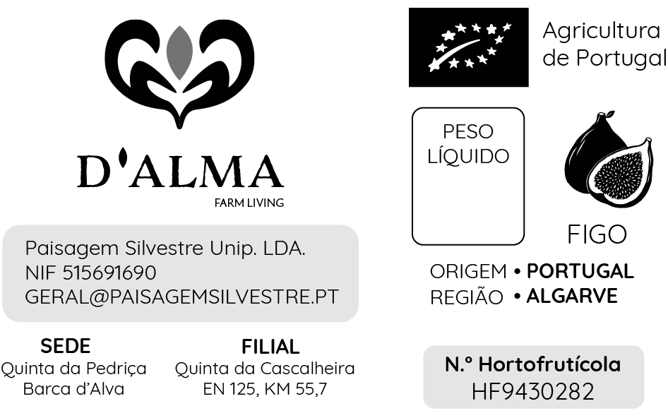
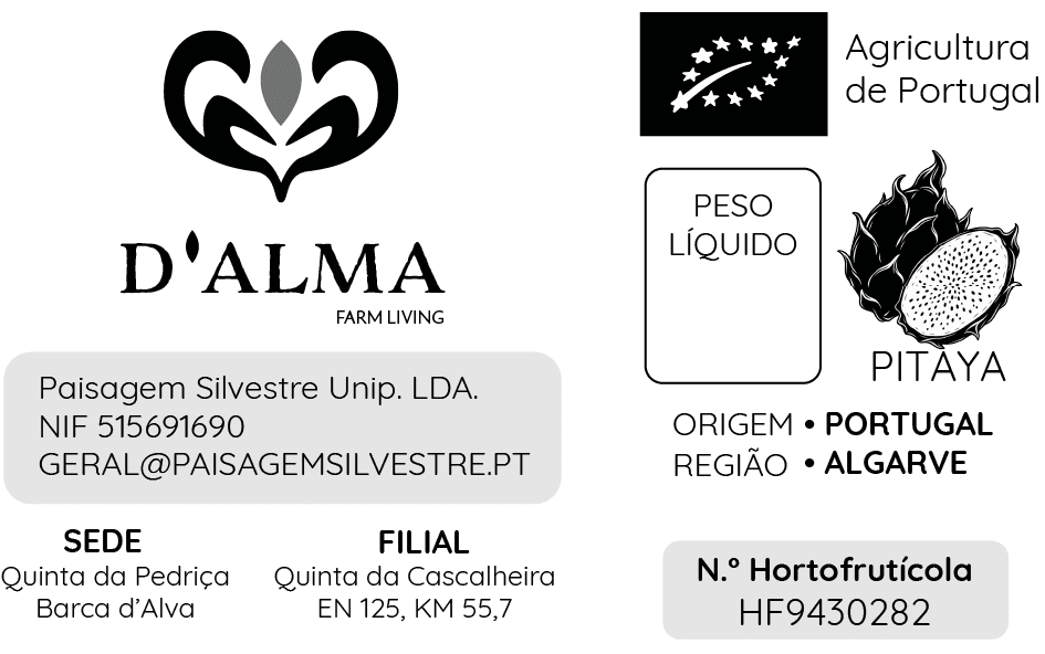
Fresh-produce labels give the brand, illustration and product name distinct areas. Origin, region and weight have dedicated fields. The same structure accommodates fig, dragon fruit and avocado, keeping reading consistent.
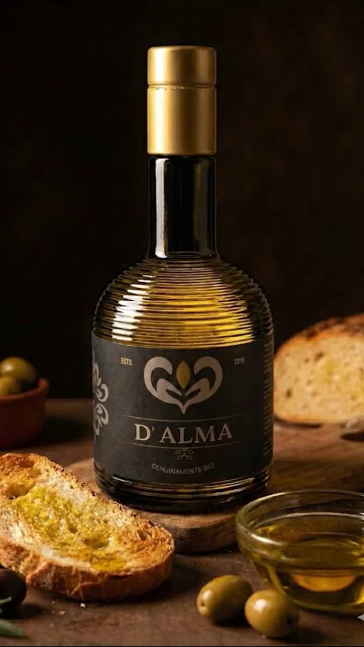
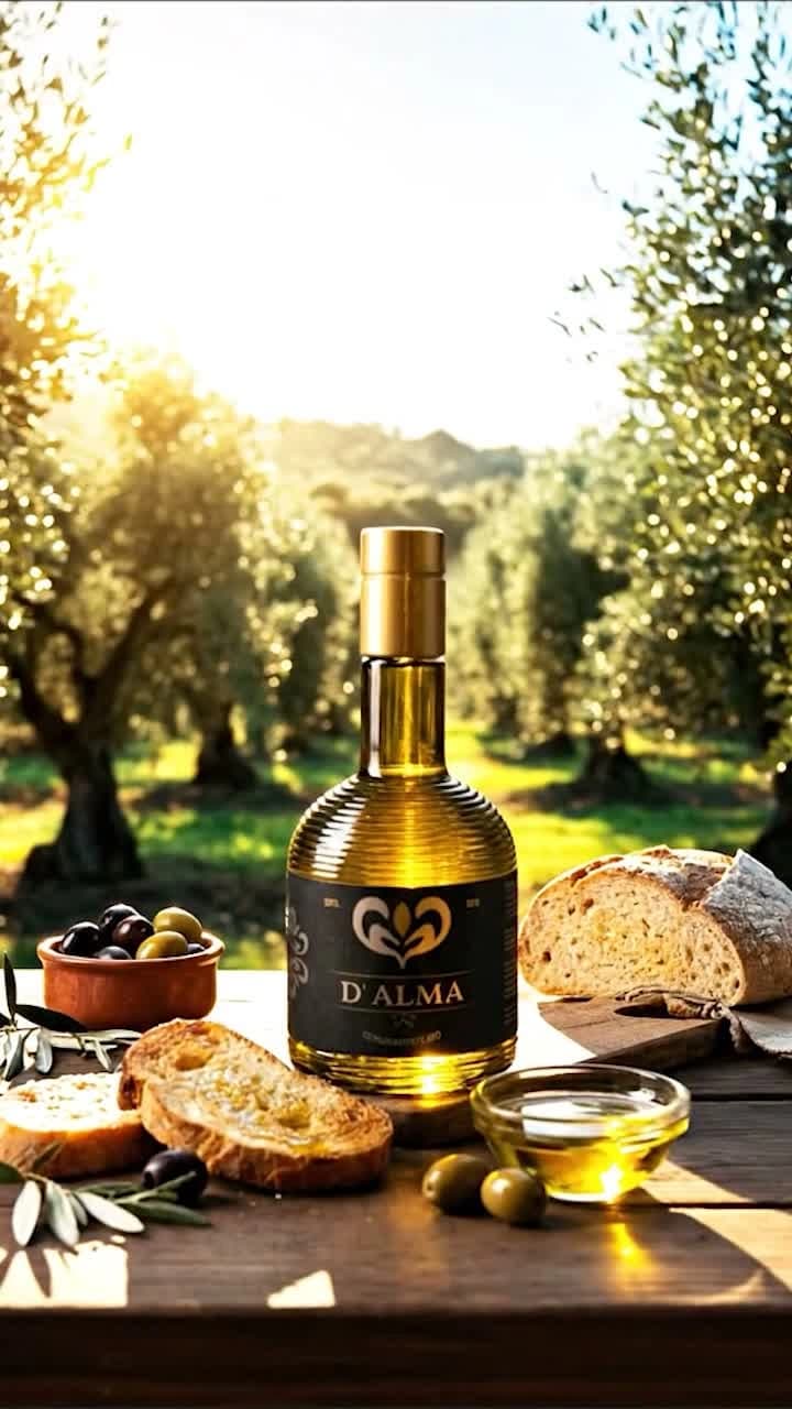
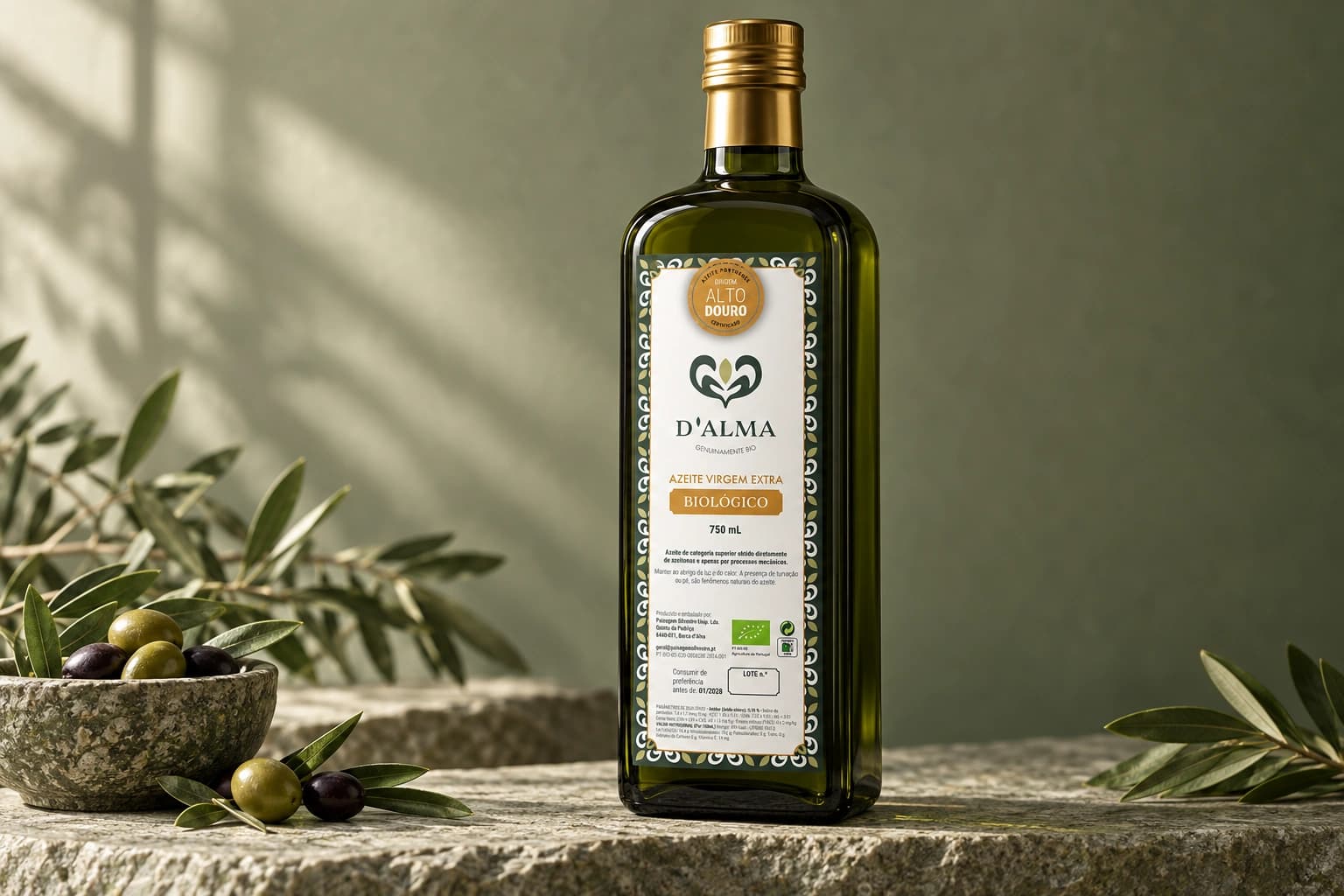
On the premium 500 mL bottle, the symbol repeats as a side tile and gold connects the label to the cap. On LinkedIn, I describe that colour as expressing the richness of the land and seed. The vertical film brings the identity to Instagram; the 750 mL label shows another application of the system.
A reading of the presented artefacts, not a reconstructed research or testing process.
The brand book provides the identity system: logo variants, colour, typography, clear space and usage rules. Labels add product hierarchy and format adaptation; Instagram translates the language into image, composition and copy in the feed. This is a brand system across physical and digital applications, distinct from an application component library.
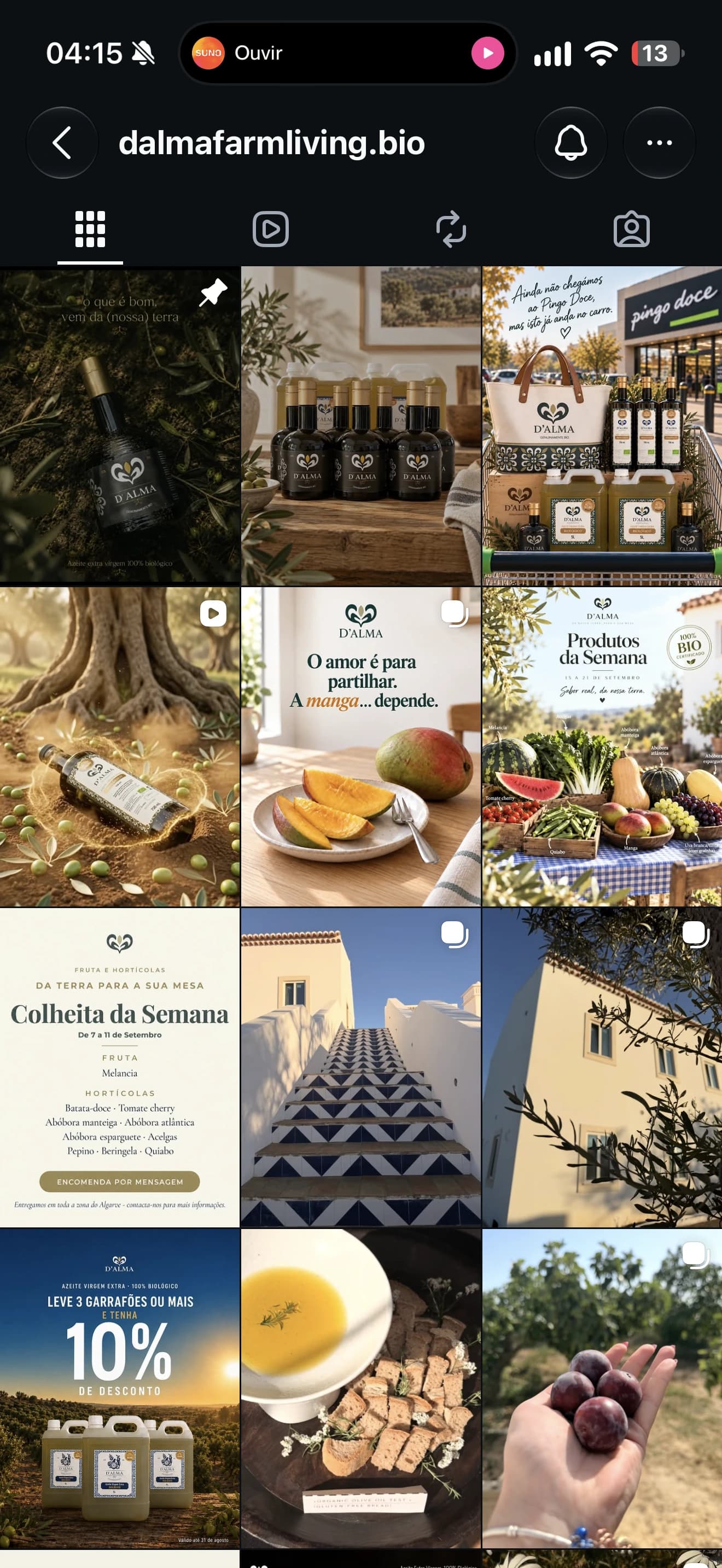
The original brand book documents logo variants, colour, typography, clear space and application rules.
A connected set of identity guidelines, packaging applications, product labels and visual communication. The archive includes editable originals and exports, showing the system beyond the logo.