Personal project · Branding & Creative Direction
Remember me,
Joolomee.
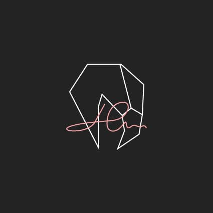
A flamingo. My name hidden in plain sight. An identity that carries my signature.
Created byJoana Lopes Mesquita
Meine RolleBrand concept, visual identity & art direction
ProjektMy own design brand
Context and design rationale
Remember me, Joolomee is my identity as a designer. The challenge is to bring product, branding and communication work into a recognisable personal signature without competing with client identities.
The symbol depicts a flamingo head with my name hidden over it. The relationship between figure and signature adds a moment of discovery. In the portfolio, original logo files sit alongside a site-specific interface system that organises projects and makes contact straightforward.
Reading and interaction flow
An editorial synthesis of the presented materials, prepared for this case. It is not a documented production or research workflow.
- Recognise the signature
- Explore projects
- Understand the contribution
- Get in touch
System and applications
The identity uses original symbol and signature files. The site has its own tokens and components, documented on the Design system page: colour, typography, spacing, radii and motion. Brand application rules and website components are connected but distinct layers.
01 / Purpose
A name to remember.
Remember me, Joolomee gives my work a recognisable home. It brings together the brands, visual communication and digital experiences I create under one personal identity.
Joolomee comes from my full name: Joo from Joana, lo from Lopes and mee from Mesquita. Three parts of who I am, brought together in one name.
The name is an invitation to remember the person behind the work. The design challenge is to make that personal connection visible while keeping the identity clear across different contexts.
02 / Reading the symbol
Look once. Then look closer.
The geometric outline is a flamingo’s head. My name is hidden over it, woven into the composition as a signature. Both belong to the same mark.
The straight edges give the head its structure; the handwritten gesture brings a personal layer. That contrast is the central visual decision of the identity.
03 / Original versions
One identity. Different contexts.
These are the original supplied files, with their colours and lettering preserved. The website’s pink, magenta and violet accents belong to the surrounding interface; they do not replace the colours within the logo.
04 / Logo application
Protect what makes it mine.
Practical guidance for applying the original artwork consistently across the portfolio.
Original artwork. Always.
Use the supplied logo files. The lettering, flamingo and signature form the identity; do not redraw them or substitute a font.
Keep the proportions.
Scale the artwork uniformly. Keep the relationship between the head and the overlaid name intact, without cropping, stretching or rotation.
Give the mark room.
Leave clear space around the whole artwork. Text, edges and other graphics must not cross the fine lines or the signature.
Choose the right background.
Use the original light or dark version for its intended surface. Keep the supplied colours; avoid overlays, filters and effects that weaken the drawing.
Check the small details.
At the final display size, the hidden name and fine lines must remain legible. If they disappear, increase the size or use an appropriate original version.
Let the layout move.
Motion can reveal the identity and guide attention. It must not deform the logo, separate its parts or make it difficult to read.
05 / From identity to experience
The brand lives here.
This portfolio is an application of the identity: original logo assets, a consistent visual language and project presentations that make the work easy to explore. The flamingo also appears as a photographic presence, distinct from the original logo.
The original logo files and their application on this site show how the identity moves from a personal symbol to a digital experience.
Explore the website’s design system ↗