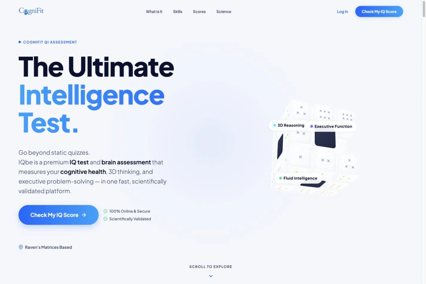
The IQ Test page introduces a reasoning assessment to people who are still deciding whether to begin. Before the test, the interface needs to explain the experience, provide context for the assessed abilities and make the entry point clear. The challenge is to balance visual curiosity with information that supports that decision.
My contribution was UX/UI design and creation of the landing page. A three-dimensional cube provides the visual entry point, with blue accents and light surfaces connecting the presentation to CogniFit. The content sequence connects the initial proposition to the assessment explanation, the results being presented and frequently asked questions. The acquisition page and the assessment itself are distinct scopes.
Reading and interaction flow
An editorial synthesis of the presented materials, prepared for this case. It is not a documented production or research workflow.
01Identify the test proposition
02Explore assessed abilities
03Understand the results presentation
04Resolve questions and begin
Page structure · reading schematic
Created to explain the existing delivery. This is not an original wireframe from the design process.
01 · Identify the test proposition
02 · Explore assessed abilities
03 · Understand the results presentation
04 · Resolve questions and begin
Meine Rolle
UX/UI design and landing page creation. My contribution in this case is the product discovery experience: page structure, interface, visual direction and connection to the CogniFit platform.
Problem
How do you introduce an interactive reasoning assessment to someone looking for an IQ test? The page needs to explain the experience, the skills involved and score interpretation before inviting visitors to begin.
Constraints
Research
Options considered
Decisions & why
Show the type of experience
The three-dimensional cube puts visual reasoning at the centre of the first impression. Labels connect the object to cognitive skills. The composition brings communication closer to product behaviour without reproducing the full assessment.
Answer before asking for a decision
Comparison, skills, process and score interpretation structure the explanation. The sequence moves from initial curiosity to a concrete description of what the assessment involves.
Add depth without interrupting reading
Validation details and FAQs use expandable content. Supporting information remains available to readers who need it, while CTAs retain a recognisable action throughout the page.
A reading of the presented artefacts, not a reconstructed research or testing process.
Components & system
The visible component set includes the hero, primary CTA, capability blocks, result presentation and expandable content. Hierarchy separates the main action from supporting information. The cube is a communication device, not a substitute for information architecture. Exact tokens, variants and states should be tied to source files before being presented as system documentation.
Outcome
A published page combining visual presentation, product explanation, supporting information and an entry point to the assessment.