Branding · Print & environmental graphics
CarlaGonçalves
An identity you can hold. A brand you can walk into.
Logo, business card, window vinyl and acrylic signage designed by Joana Lopes Mesquita for CarlaGonçalves · Estética & Bem-Estar.
Context and design rationale
CarlaGonçalves needs an identity that supports contact with the beauty and wellbeing space: from the window and opening hours to booking and the card someone takes home. Each format has a different reading distance, information density and purpose.
I created the logo, business card, window vinyl and acrylic artwork shown. The work connects brand recognition with practical information, keeping contacts, opening hours and service information legible. Original artwork documents the pieces; the presentation settings are mockups.
Reading and interaction flow
An editorial synthesis of the presented materials, prepared for this case. It is not a documented production or research workflow.
- Recognise the space
- Read practical information
- Book or visit
- Keep the contact details
System and applications
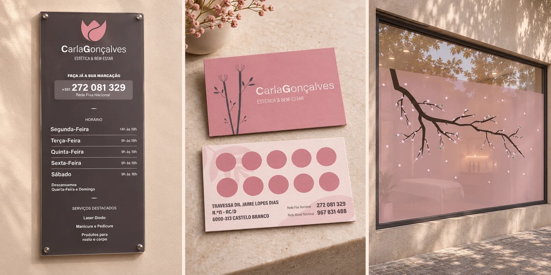
The application system connects the signature, typography, colour and information hierarchy. The card organises contact details and stamps; the window identifies the space; the acrylic sign supports booking and visits. These formats do more than resize a logo.
01 / Mein Beitrag
From recognition to information.
I created the logo and its applications across print and physical signage. Each format has a different job: identify the business, communicate opening hours and bookings, or keep contact details close at hand.
The collection includes different iterations of the identity. The original artwork is shown below without replacing its typography or historical graphics.
02 / Logo
A recognisable signature.
Original lettering extracted from the supplied acrylic artwork. Displayed without the flower symbol in the portfolio’s brand directory.
03 / Business card
Two sides. Two purposes.
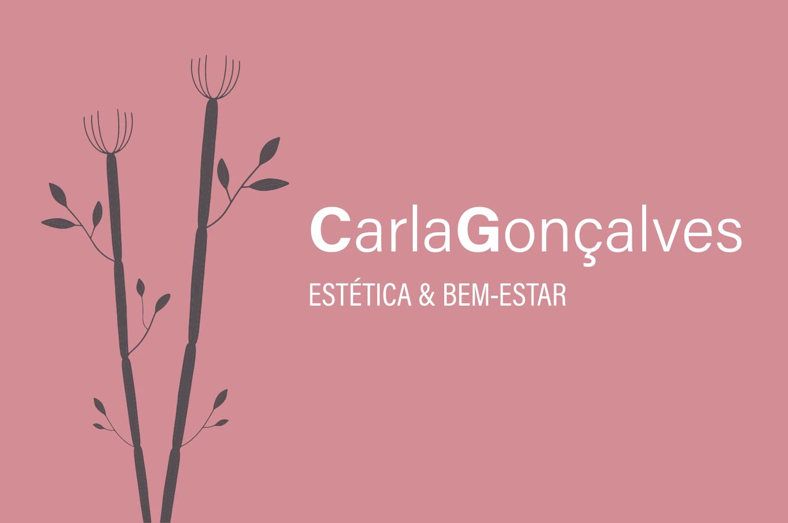
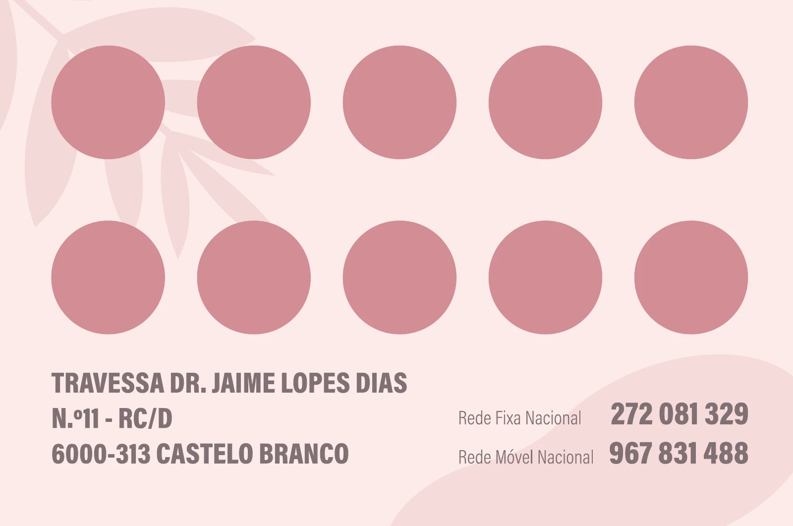
The front introduces the identity. The reverse combines contact information with ten spaces for stamps.
04 / Acrylic signage
Useful before you enter.
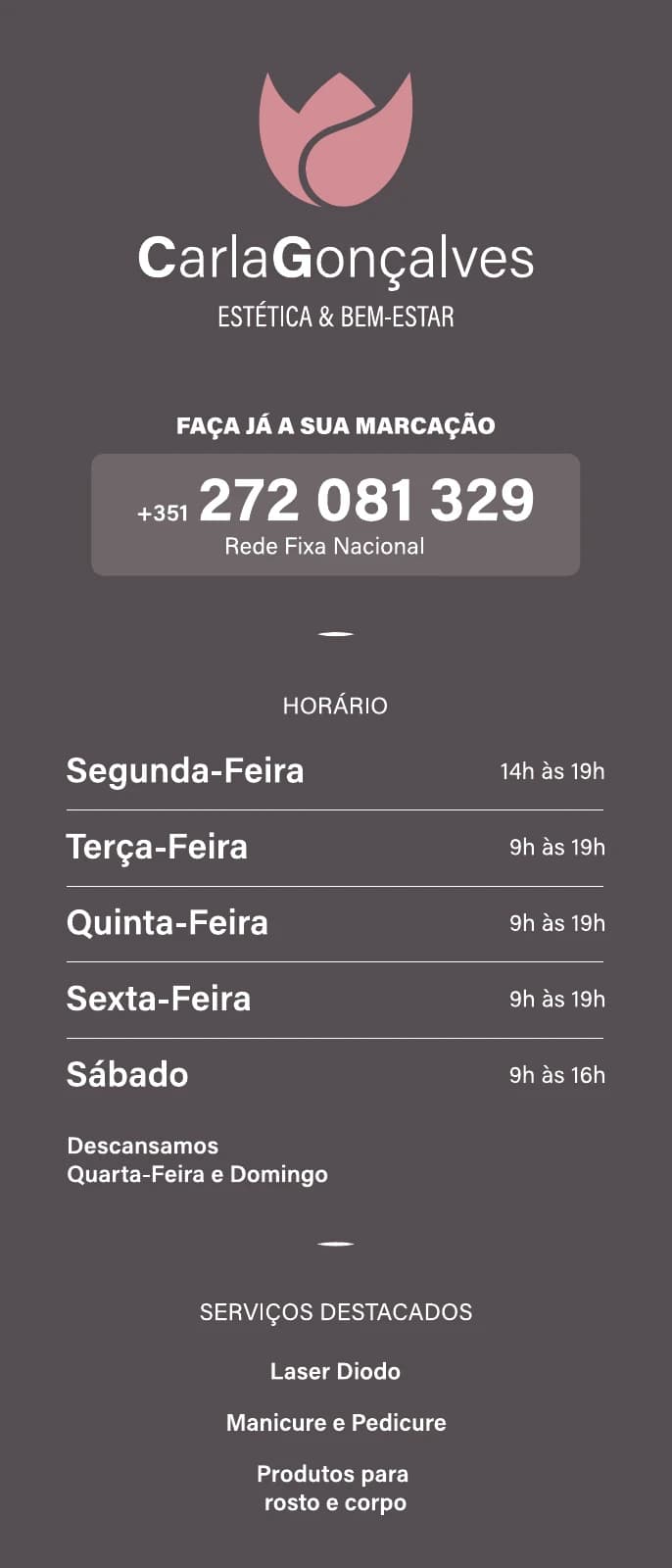
The 2025 artwork gives priority to the booking number, followed by opening hours and featured services. The vertical composition keeps the information in one reading sequence.
Mockup using the complete original artwork, including the symbol present in that version.
05 / Window vinyl
Design at the scale of a space.
Window and door artwork recovered from the original Illustrator file. The framed compositions below simulate application to glass and preserve each artwork’s proportions.
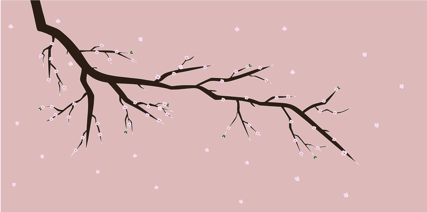
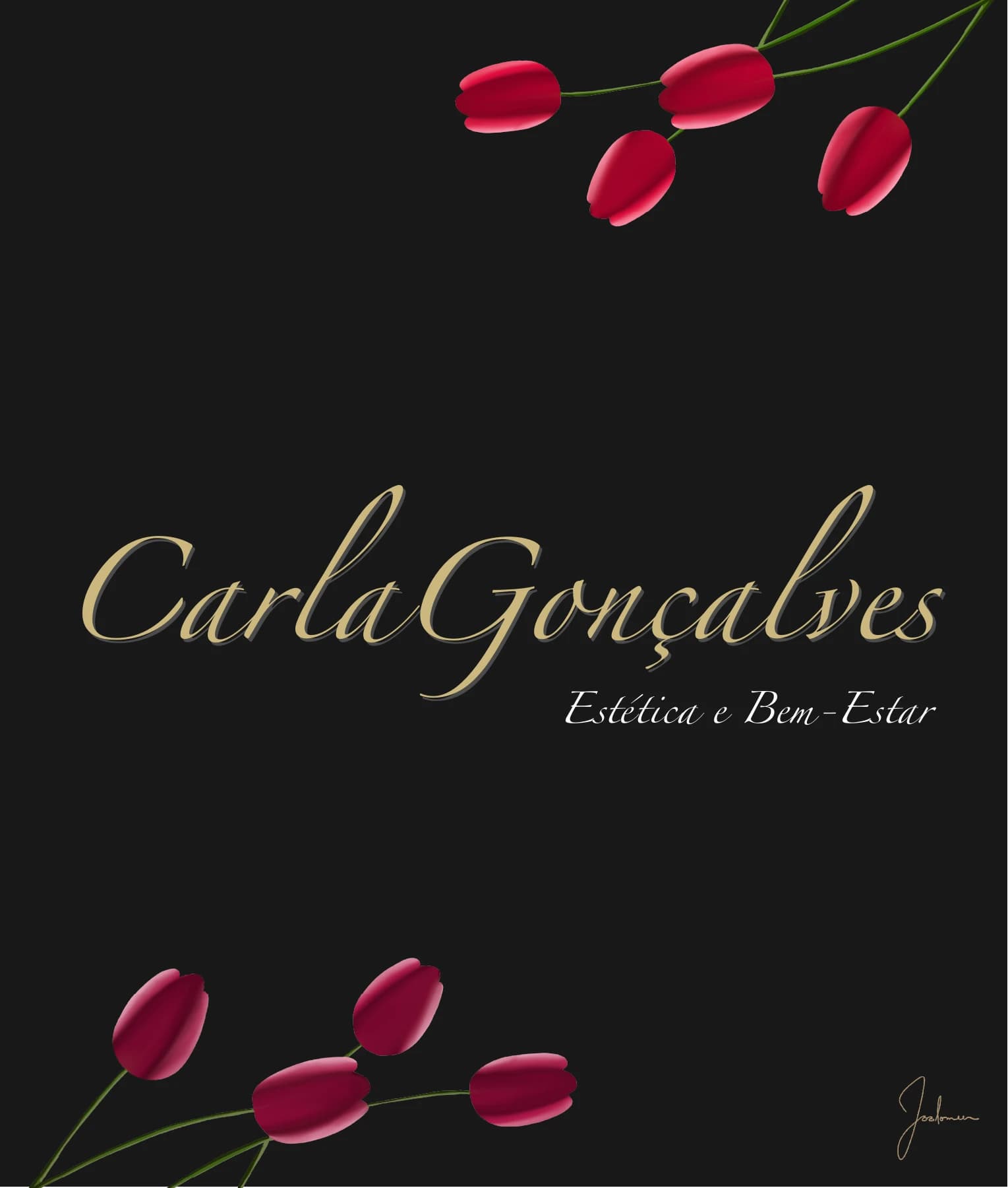

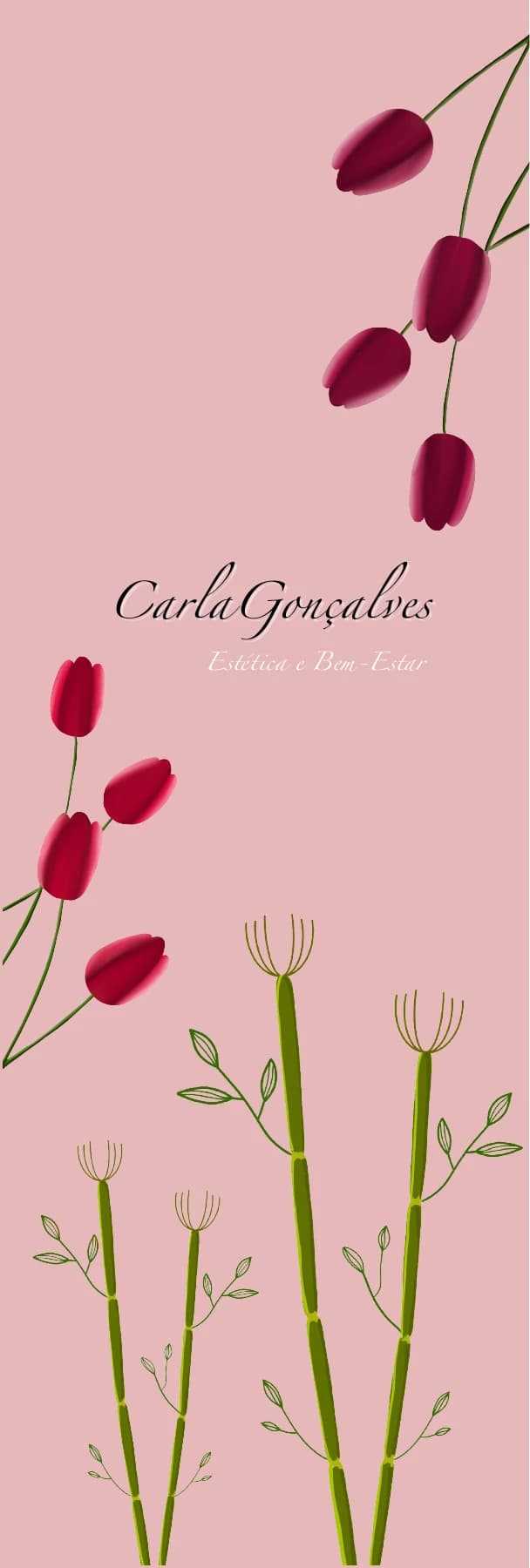
Illustrative layout, not a survey of the existing storefront. Artwork from different iterations is presented as a collection.